NextStep Bionics & Prosthetics required a rebranding based on the company's technological growth. Based on research and findings compiled by H Communications, I was brought in to develop creative which would establish brand consistency in all marketing materials needed. The overall design stems from the tagline: Expertise in Motion. This unique company is helping amputees of all ages find movement in their life that wasn't possible before. Their technological expertise and compassion help their clients to make positive advancements both physically and mentally. The rich color palette, image treatment and contemporary typefaces were carefully chosen to reinforce the company's expertise in the field paired with their passion for making a difference in their clients quality of life.
Projects have included: office merchandising, trade show display & retractable banners, print advertising, website redesign and online banner advertising.
Projects have included: office merchandising, trade show display & retractable banners, print advertising, website redesign and online banner advertising.
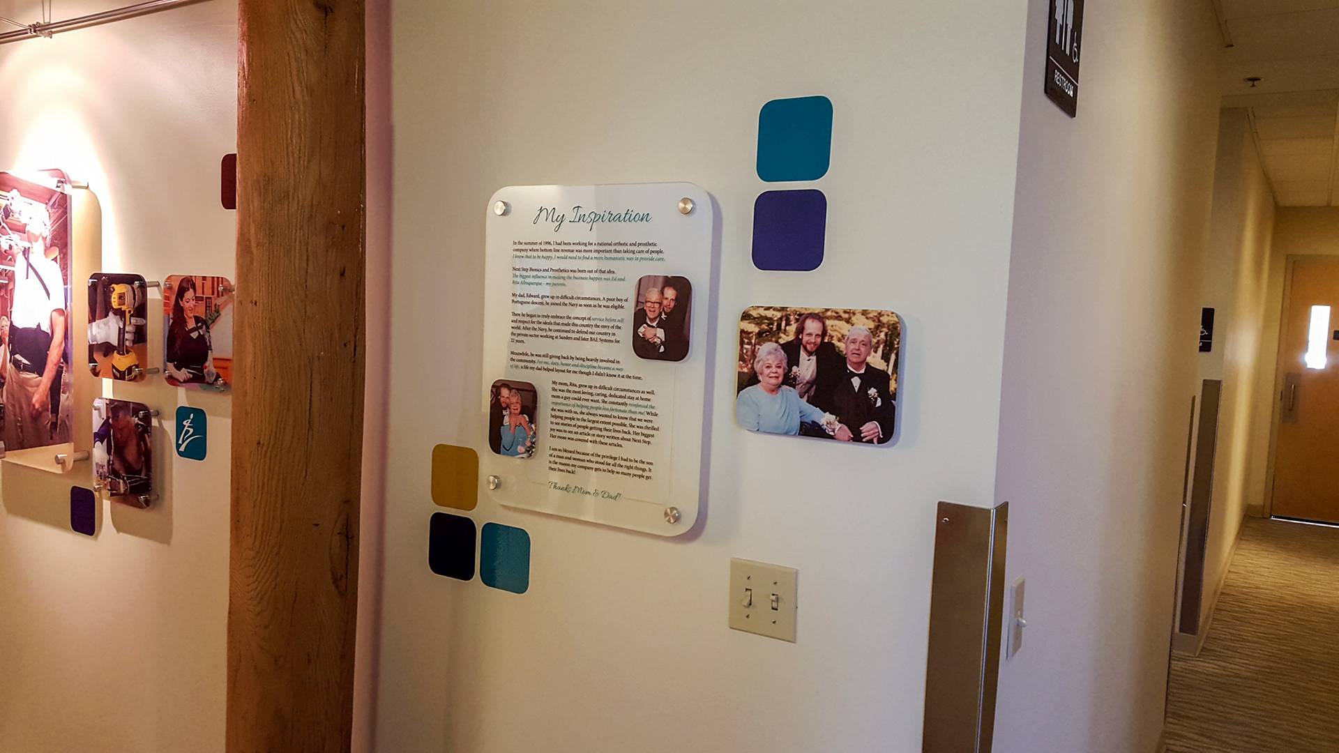
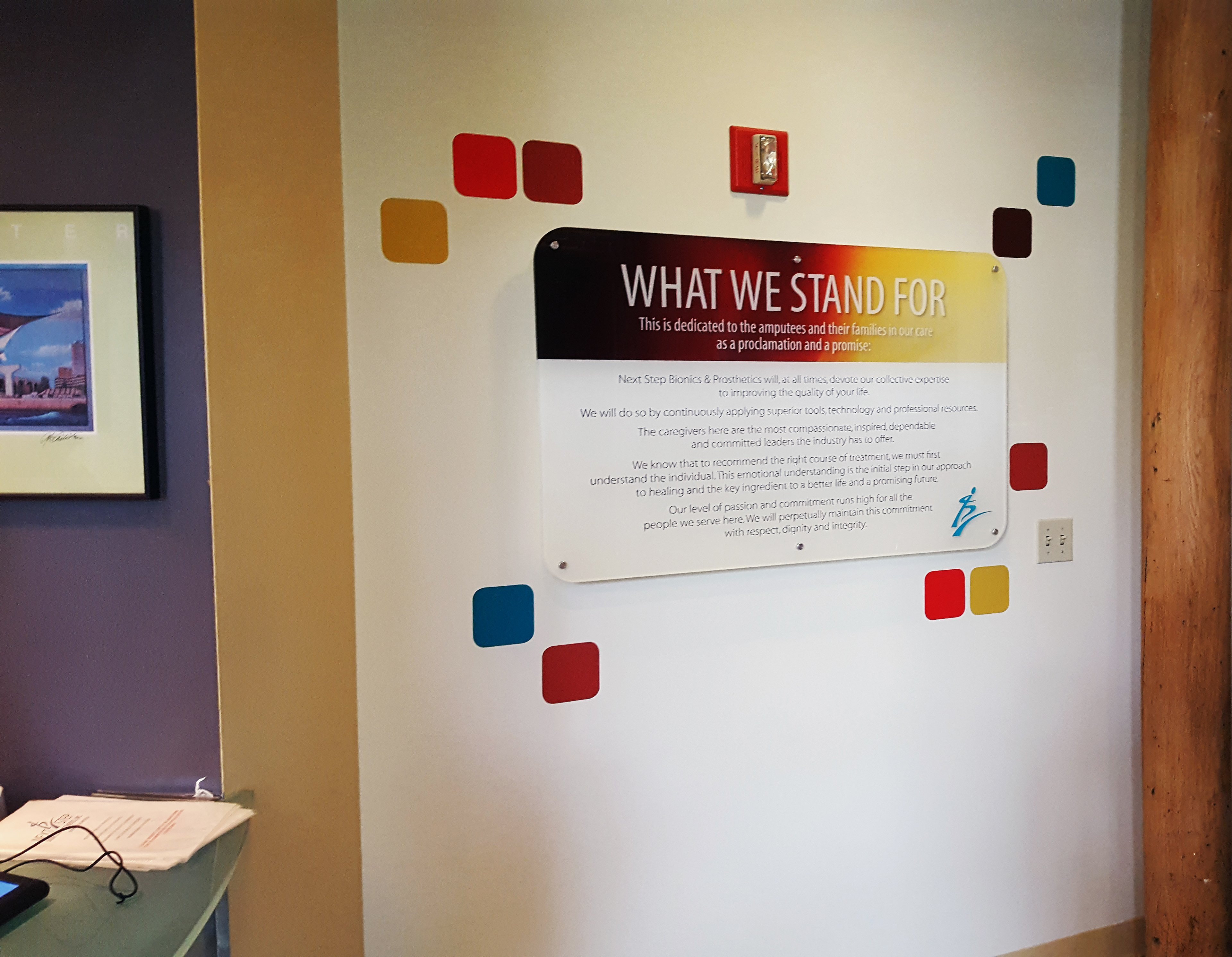
PROJECT: Evaluate each of the three office locations and offer merchandising solutions that would engage, impact and educate clients.
Created a dynamic layout which could be easily adapted to the challenging footprint of each office space. A gallery, museum-style approach was taken in the design. Acrylic, vinyl and nickel finish hardware were recommended for materials so as to weave in a technological and timeless look and feel. The acrylic material used to showcase the client photography varied in size, thickness and distance from the wall. The staggered placement of images and color vinyl squares was meant to mimic the ups and downs that clients experience emotionally on the road to recovery. Images captured moments of motion and achievement – offering motivation and inspiration for those just beginning their journey and accomplishment for those reaching their goals.
Created a dynamic layout which could be easily adapted to the challenging footprint of each office space. A gallery, museum-style approach was taken in the design. Acrylic, vinyl and nickel finish hardware were recommended for materials so as to weave in a technological and timeless look and feel. The acrylic material used to showcase the client photography varied in size, thickness and distance from the wall. The staggered placement of images and color vinyl squares was meant to mimic the ups and downs that clients experience emotionally on the road to recovery. Images captured moments of motion and achievement – offering motivation and inspiration for those just beginning their journey and accomplishment for those reaching their goals.


PROJECT: Using an existing booth structure, design new signage to include a header, center panels and podium graphic. Each sign velcro's to the fabric display. A retractable banner was also created for various PR events (shown lower left).
Visually showcased NSBP as a technologically advanced company whose expertise and compassion made a difference in the lives of their clients. A dynamic grid was recommended, incorporating silhouetted images of individuals in motion with other photos masked within squares that stagger to mimic the ups and downs of recovery. The color scheme is rich and vibrant using a palette of reds, yellows, blues and teals.
Visually showcased NSBP as a technologically advanced company whose expertise and compassion made a difference in the lives of their clients. A dynamic grid was recommended, incorporating silhouetted images of individuals in motion with other photos masked within squares that stagger to mimic the ups and downs of recovery. The color scheme is rich and vibrant using a palette of reds, yellows, blues and teals.
PROJECT: Produce a file folder to be handed out at trade show events so that attendees would have added value in a functional piece.
Created an eye catching as well as informational piece that the recipient would want to hold onto and use at home or work. The back cover incorporated the brand print ad with the interior pages showcasing the booth graphics and general company information. The high gloss aqueous coating and extra thick stock helped give this piece a tactile feel of substance and quality.
Created an eye catching as well as informational piece that the recipient would want to hold onto and use at home or work. The back cover incorporated the brand print ad with the interior pages showcasing the booth graphics and general company information. The high gloss aqueous coating and extra thick stock helped give this piece a tactile feel of substance and quality.

