

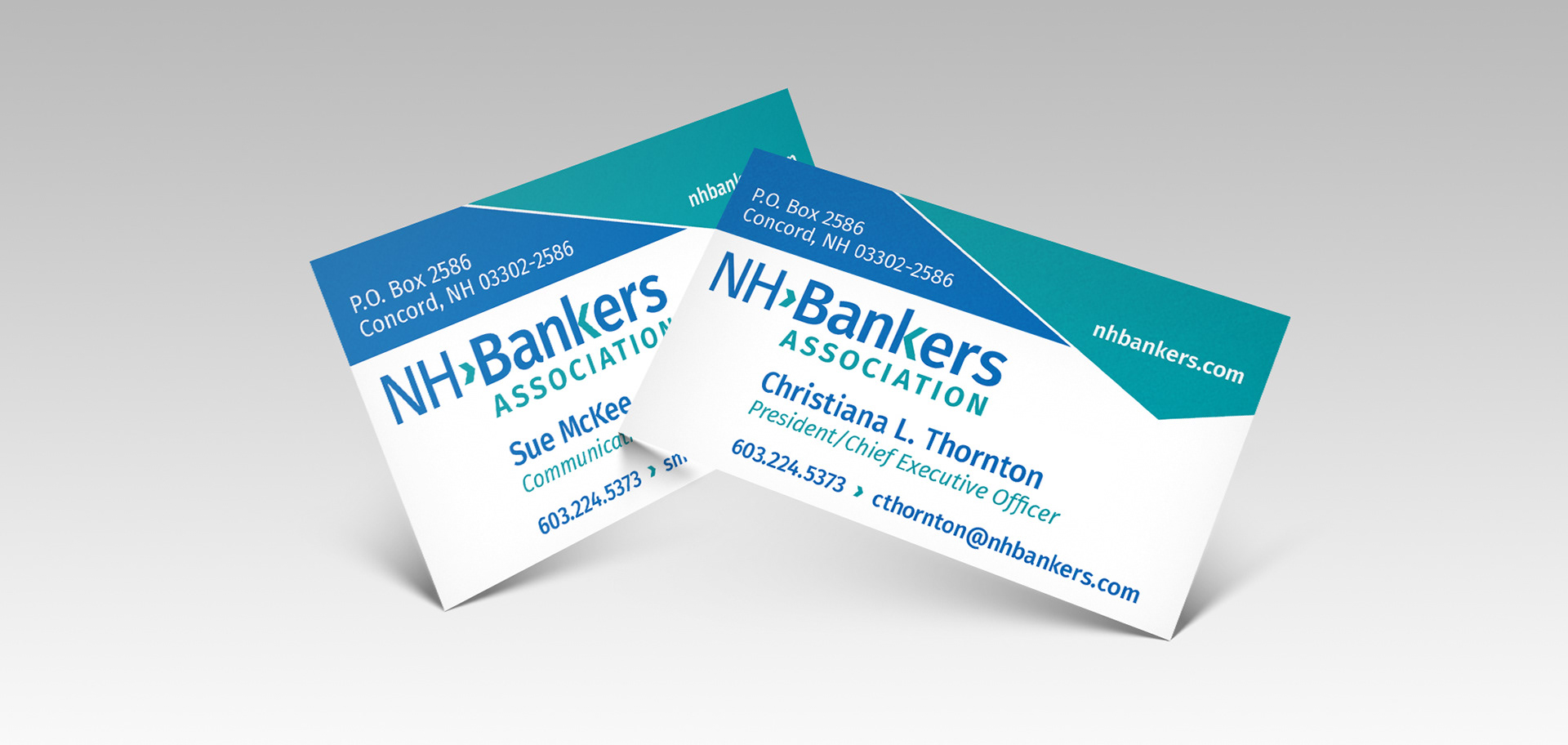
PROJECT: Design a business card to visually reinforce this organizations non-stop commitment of advocating for the banking industry.
The goal was to break out of the misconception that banking is conservative and outdated. Bold angles were incorporated to complement the arrows in the logo as well as provide a more dynamic look and feel.
The goal was to break out of the misconception that banking is conservative and outdated. Bold angles were incorporated to complement the arrows in the logo as well as provide a more dynamic look and feel.

PROJECT: Provide a branded design template for letter size inserts to be included within an Advocacy Packet.
Eight inserts were designed and provided to the client upon completion for future in-house editing. Style sheets were created for consistency among the pages in InDesign.
Eight inserts were designed and provided to the client upon completion for future in-house editing. Style sheets were created for consistency among the pages in InDesign.
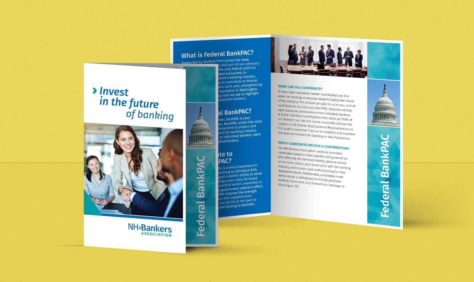
PROJECT: Design a distinctive letter size brochure which could be easily printed in-house by numerous institutions.
Short folds are a great, easy solution to add uniqueness to a brochure. Instructions were provided within this Advocacy Packet explaining where exactly to fold the letter size page. Being printed in-house, a margin was woven into and accounted for in the design. Stock photos and triangular patterns were chosen to help visually relay the importance of getting involved and making a difference as a member by contributing.
Short folds are a great, easy solution to add uniqueness to a brochure. Instructions were provided within this Advocacy Packet explaining where exactly to fold the letter size page. Being printed in-house, a margin was woven into and accounted for in the design. Stock photos and triangular patterns were chosen to help visually relay the importance of getting involved and making a difference as a member by contributing.

PROJECT: Using client supplied template, design a branded retractable banner.
Building brand awareness in a visually impactful way was the goal for this retractable banner design. The background pattern and bold angled blocks of color relay their commitment to taking action and making a difference.
Building brand awareness in a visually impactful way was the goal for this retractable banner design. The background pattern and bold angled blocks of color relay their commitment to taking action and making a difference.

PROJECT: Create a 125th anniversary logo.
This 125th logo needed to have an overall consistency in style with the NH Bankers logo being woven into the design. Usage of the same typefaces and arrows helped give it a clean and elegant look.
This 125th logo needed to have an overall consistency in style with the NH Bankers logo being woven into the design. Usage of the same typefaces and arrows helped give it a clean and elegant look.

PROJECT: Create a historical timeline for NHBA's 125th celebration.
The design needed to be adaptable, easily portable and unique. Initially the signage was displayed on easels and now is mounted in their conference room. To showcase NHBA's progression of achievements, interlocking posters were recommended rather than one large poster. Color palette, typefaces, arrow elements and background patterns were consistent with previously produced materials for brand recognition.
The design needed to be adaptable, easily portable and unique. Initially the signage was displayed on easels and now is mounted in their conference room. To showcase NHBA's progression of achievements, interlocking posters were recommended rather than one large poster. Color palette, typefaces, arrow elements and background patterns were consistent with previously produced materials for brand recognition.