

Several years ago, I began working with Manchester Country Club to help develop and establish a consistent brand look in their marketing materials. Over the years, there has been an evolution of the brand based on client requests to continually remain current in the competitive market. Using client provided copy and assets, any recommended design concepts were cohesive and consistent across all forms of media.
The project list is quite extensive: pocket folder, print advertising, large format posters, online digital banners, direct mailers, newsletters, and retractable banners.
The project list is quite extensive: pocket folder, print advertising, large format posters, online digital banners, direct mailers, newsletters, and retractable banners.
Should you like to see any other projects listed above that are not showcased, I'd be more than happy to share directly.
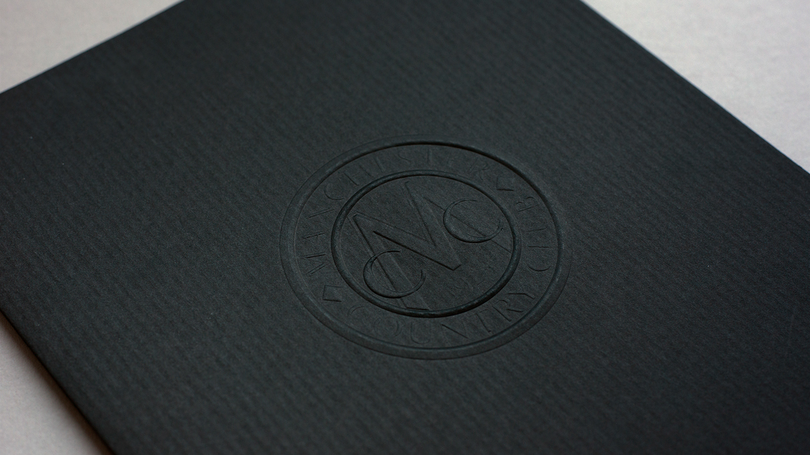
PROJECT: Create a 9x12 pocket folder that would appeal not only to brides but potential new golf members and businesses.
DESIGN PROCESS: No matter the target market, the design needed to capture a contemporary and elegant look and feel. Less is more was the thought process for this piece. The logo (which has since evolved and changed) was blind embossed on a textured stock. Neenah classic columns paper was chosen for its timeless and classic appeal.
DESIGN PROCESS: No matter the target market, the design needed to capture a contemporary and elegant look and feel. Less is more was the thought process for this piece. The logo (which has since evolved and changed) was blind embossed on a textured stock. Neenah classic columns paper was chosen for its timeless and classic appeal.
PROJECT: Create an eye-catching 22x28 poster and matching handout to be on display at wedding expos.
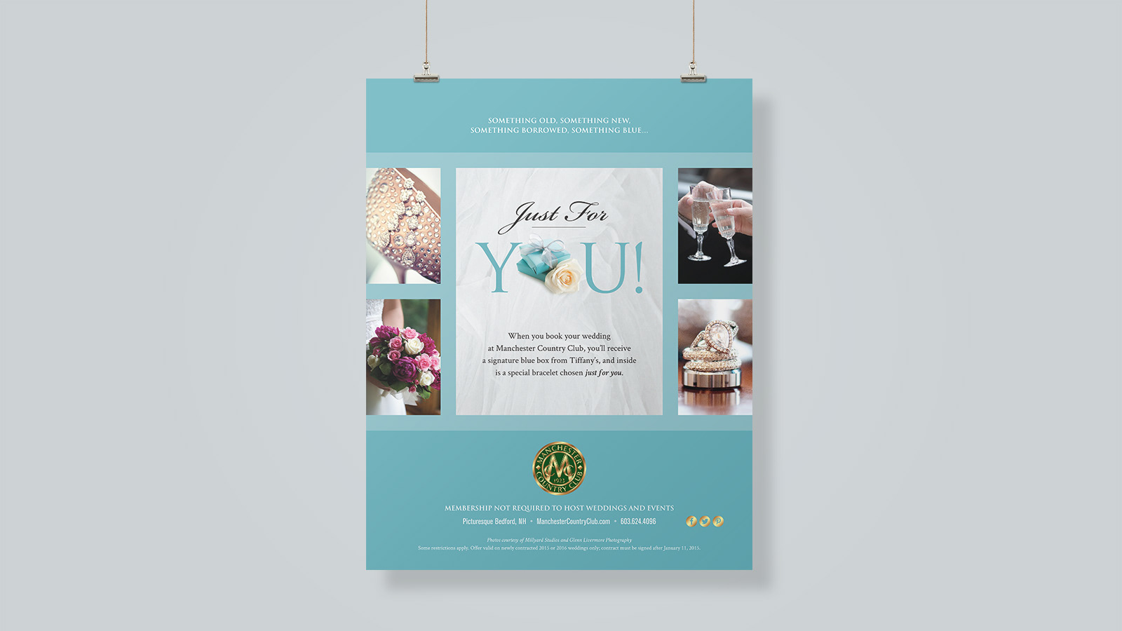
This tiffany promotion blended branding between what had been established for MCC along with Tiffany's distinctive blue. Existing client photo assets were incorporated with a royalty free image found of a "Tiffany" looking box. It was important for this design to be simple, elegant and distinctive.
This tiffany promotion blended branding between what had been established for MCC along with Tiffany's distinctive blue. Existing client photo assets were incorporated with a royalty free image found of a "Tiffany" looking box. It was important for this design to be simple, elegant and distinctive.

PROJECT: Create various assets for The Taste of MCC event held at Manchester Country Club.
The 22x28 poster (right) was designed first using client supplied assets and copy. The goal was to create an elegant, eye-catching display for the event. Typefaces, color palette and photo treatment were all part of the brand guidelines established at the time. A matching business card and handout were created as well. For added brand familiarity and visual richness, the background was designed to mimic the pocket folder paper texture.
The 22x28 poster (right) was designed first using client supplied assets and copy. The goal was to create an elegant, eye-catching display for the event. Typefaces, color palette and photo treatment were all part of the brand guidelines established at the time. A matching business card and handout were created as well. For added brand familiarity and visual richness, the background was designed to mimic the pocket folder paper texture.
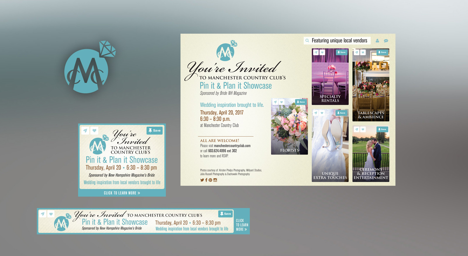
PROJECT: Design print and digital assets needed to promote the Pin it & Plan it Showcase held at Manchester Country Club.
The client knew exactly what they wanted for this promotion – a Pinterest "esque" look and feel. We began by designing an icon for MCC that would appeal to the bride market by incorporating a diamond ring. The print ad layout looked like a pinned Pinterest page highlighting client supplied photography highlighting each of the local vendors that would be at the event. Online banners were created based on the final print ad design.
The client knew exactly what they wanted for this promotion – a Pinterest "esque" look and feel. We began by designing an icon for MCC that would appeal to the bride market by incorporating a diamond ring. The print ad layout looked like a pinned Pinterest page highlighting client supplied photography highlighting each of the local vendors that would be at the event. Online banners were created based on the final print ad design.

PROJECT: Design a full page ad targeting the bride market which adheres to existing brand standards.
The brand direction has shifted over the past few years per direction from the client. These ads showcase that transition in print advertising from left to right (far right is the present day design). The logo treatment, layout, color palette, background textures and corporate typefaces have all changed. Most noticeable is the shift from a color palette of rich blacks and yellows to a more white, muted gray and blue. The goal has been to relay a more current and contemporary brand that coincides with their recently redesigned website.
The brand direction has shifted over the past few years per direction from the client. These ads showcase that transition in print advertising from left to right (far right is the present day design). The logo treatment, layout, color palette, background textures and corporate typefaces have all changed. Most noticeable is the shift from a color palette of rich blacks and yellows to a more white, muted gray and blue. The goal has been to relay a more current and contemporary brand that coincides with their recently redesigned website.