Blue Hills Bank needed a Commercial Banking capabilities brochure which would stand out from competitors when left behind by the sales team. The goal of the design was to reinforce the importance of the banking relationship and extensive experience offered when partnering with BHB. Specialty paper and printing techniques along with custom photography were woven into the design to add elements of elegance, quality and uniqueness.
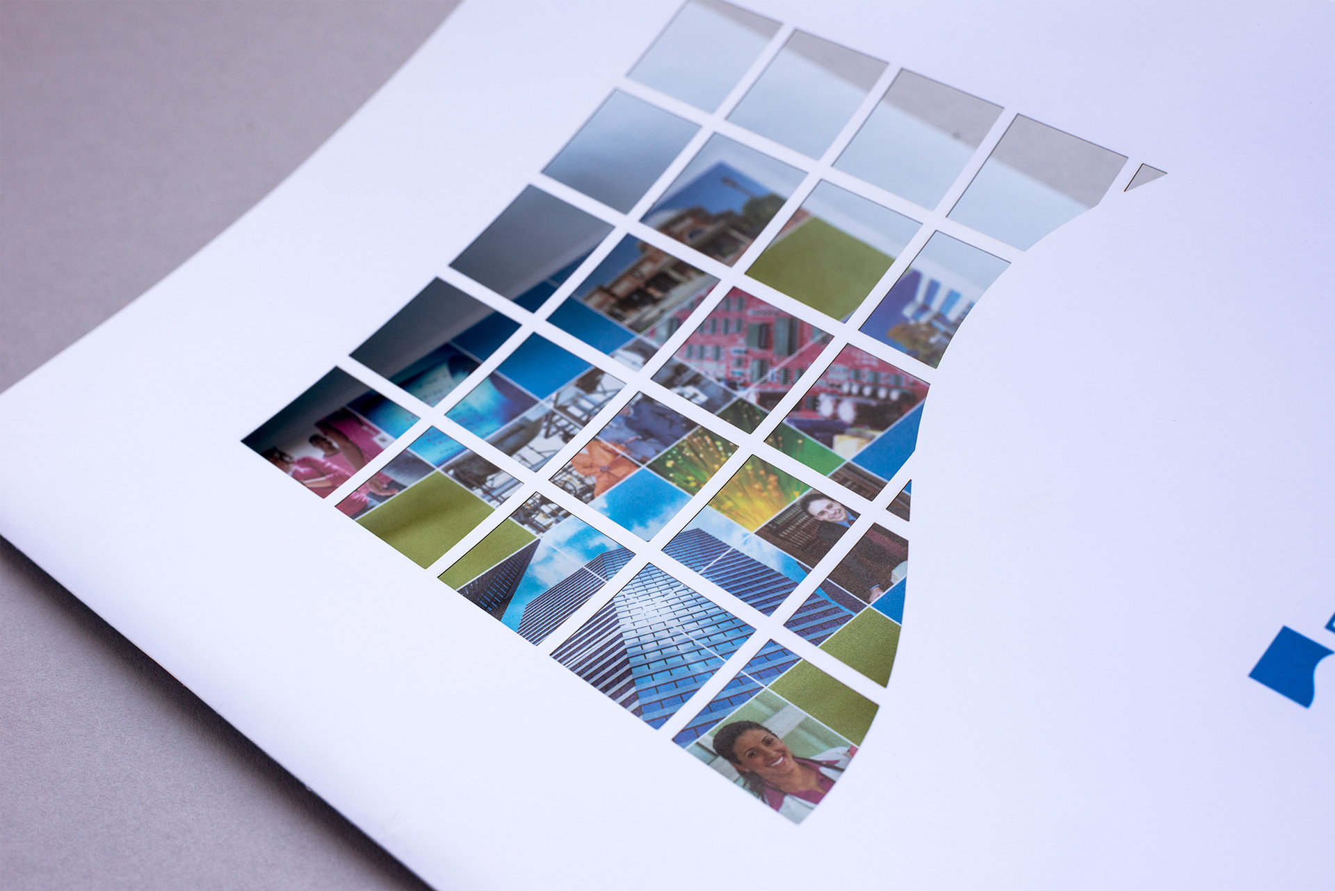
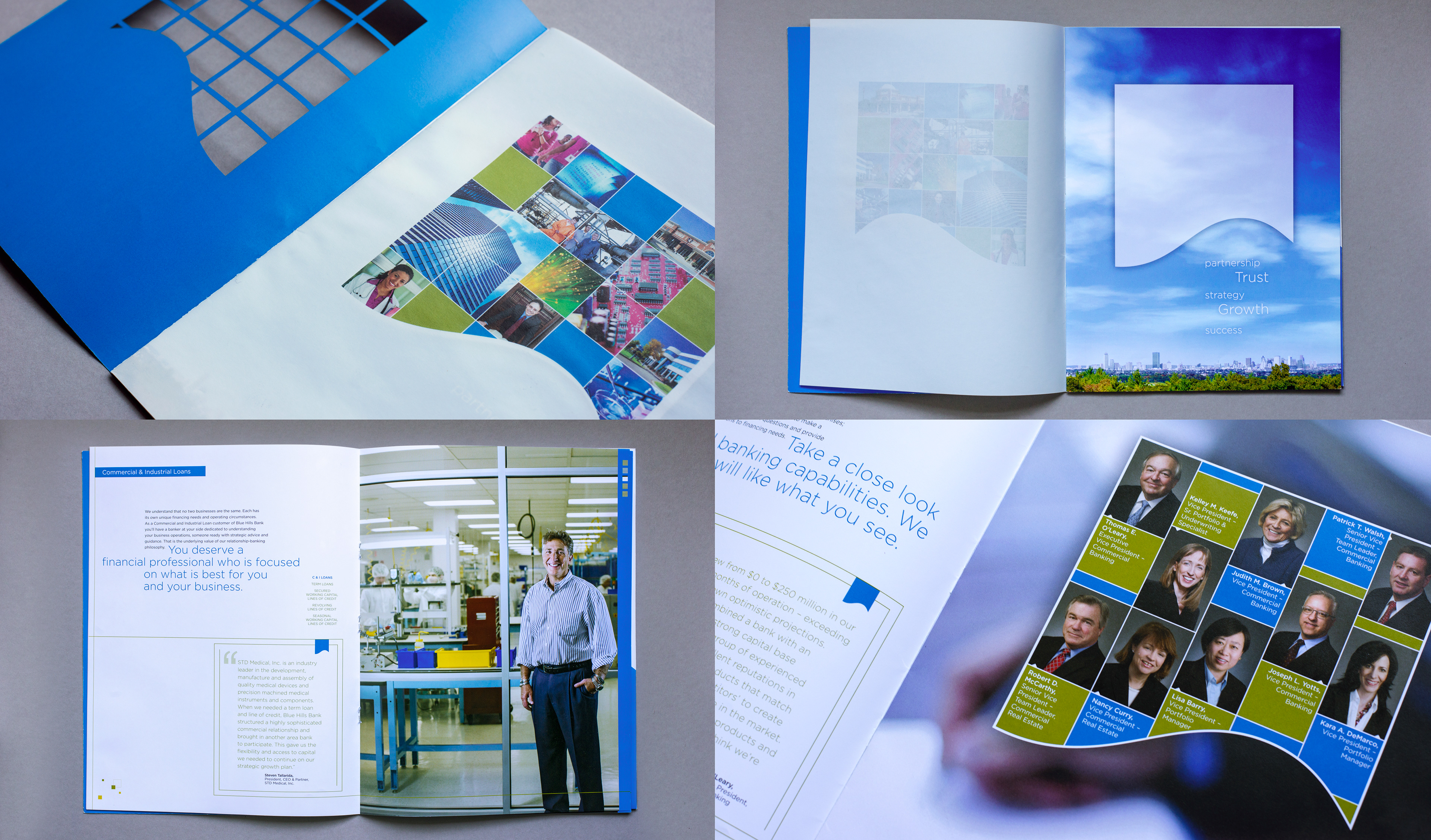
This brochure needed to have an immediate wow factor. The laser die cut cover revealed targeted industry specific images masked within the BHB brand mark. Once opened, the viewer sees the industry specific imagery printed on an opaque paper. Alignment was critical to coordinate between the diecut cover and the printed page underneath where the brand mark is used as a frame for the industry imagery. To consistently reinforce the brand, the brand mark is given dominance throughout the piece and is the first and last thing seen visually.
This brochure needed to have an immediate wow factor. The laser die cut cover revealed targeted industry specific images masked within the BHB brand mark. Once opened, the viewer sees the industry specific imagery printed on an opaque paper. Alignment was critical to coordinate between the diecut cover and the printed page underneath where the brand mark is used as a frame for the industry imagery. To consistently reinforce the brand, the brand mark is given dominance throughout the piece and is the first and last thing seen visually.
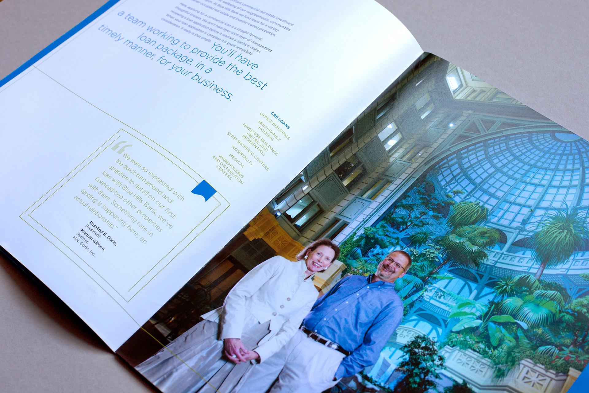
Key phrases and words were enlarged throughout so that the main message from each spread was quickly viewed. To mimic the diecut technique on the interior pages, small squares within the blue strip expose the hero image in the right hand corner. Small squares of color were also scattered on the text pages – using colors from the coinciding hero image – to support BHB's ability to adapt to each clients needs. All customer photos were art directed by me with each business location offering its own set of challenges to achieve a successful shot.
Other projects for BHB have included: annual reports, pocket folders, inserts, and oversized postcards.
Other projects for BHB have included: annual reports, pocket folders, inserts, and oversized postcards.